Delivery Management Application
Simplifying delivery for an Australian client
Problem Statement :
To design experience for delivering goods in Australia.
Proof of delivery is where goods dispatched are delivered and the actual delivery date/time is recorded i.e establish and prove that the intended recipient has received the goods.
Currently, in the client, a sales order or transfer order can be processed up to the time of dispatch. However, once dispatched the fate of the goods is assumed, no evidence of what actually occurred is stored.

Roles for designing the experience:
We were a team of few UX Designers who worked on improving the end-to-end experience of the product and helping the client manage their deliveries efficiently and hassle-free.
The team included manikanta kamuni, Joydeep Sengupta, nimisha Jain, and BhavyaSree Rallapalli
Our Process

→Discovery
As the budget & time was limited, we used the internet & asked Amazon, Myntra and other delivery executives from different services to provide the basis for my research. We created a none leading script and conducted the interviews in person and quickly found that specific groups of users were making themselves apparent as well as clear red routes building on mental models of my users.

The questions that were included in the interview are-
What is the process of loading the truck?
On what basis orders are grouped into manifests?
What is the time in manifest header details?
Does the driver need to know the position of next order in the truck through the system?
How are exceptions and emergency situations handled like truck breakdown etc?
To whom the receipt is sent after delivery?
What is the process of return?
→ Define
After conducting the interviews and gathering all the raw information it was time to consolidate the data to make personas and develop user stories.
Users of this application:
Primary | Drivers- Drivers who are registered by the admin and they will the major users of this app. They can view, scan and process the orders
Secondary | Contractors- They can just view the orders, these are the people who assist the drivers during delivery
Tertiary | Admins- Admins or the guys who are sitting in the HQ who are managing the whole system and the employees.
#Persona Creation

→ Ideate
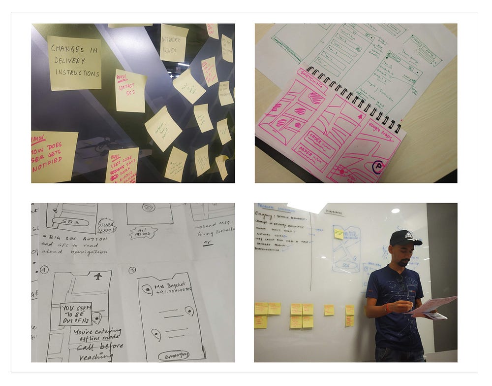
After consolidating all the interview data I created an affinity diagram to see common groups of users, how they are currently behaving when going out for delivering and loading shipment, and also what value this app could offer them. I also found the most frequently mentioned goals which allowed me to see initial Red routes and help develop user stories.
#Affinity Diagram
It was brainstorming time, our team sat down to bridge the gap between stakeholders and product owners. We followed the practice of affinity diagramming to design flows by keeping the user at the center.

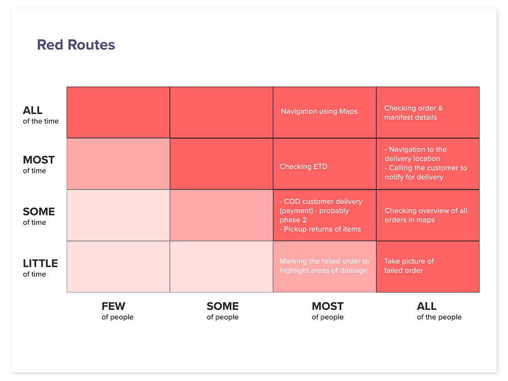
#Red Routes
Red Route analysis gave us a brief understanding of the features that are most important in the product. It also enlightened us about the features that are not much used by the users and increase frustration.


#Competetive Analysis
We took inspiration from some of the major apps of this industry and a few others for visual design ideas, namely:
- Uber Freight — freight management app
- Amazon — delivery network and enterprise solutions for Amazon eCommerce services
- Chronopost — delivery performance management app by DFD
#User Stories
We always consider this part of the gentle synthesis of research and actual product design. Although technically we’re not designing the product yet, it’s only natural to think about these flows and questions in a more tangible way. We find (if we have time) creating detailed user flows can focus my mind on function and possible user decision-making factors at these points. We find it relaxing and therapeutic also!

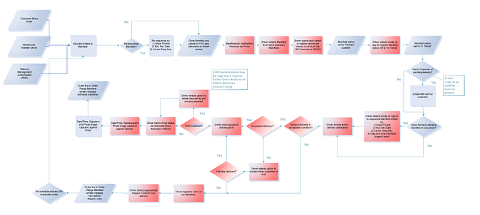
#Designing the flows
After submerging in the user stories it was time for solving and make those tasks easier for the user so we sat down brainstorming and make the user flows.


→ Prototype
In this step, we consolidated our research to give wireframes, low fidelity mockups, mid-fidelity mockups, and high fidelity prototype.
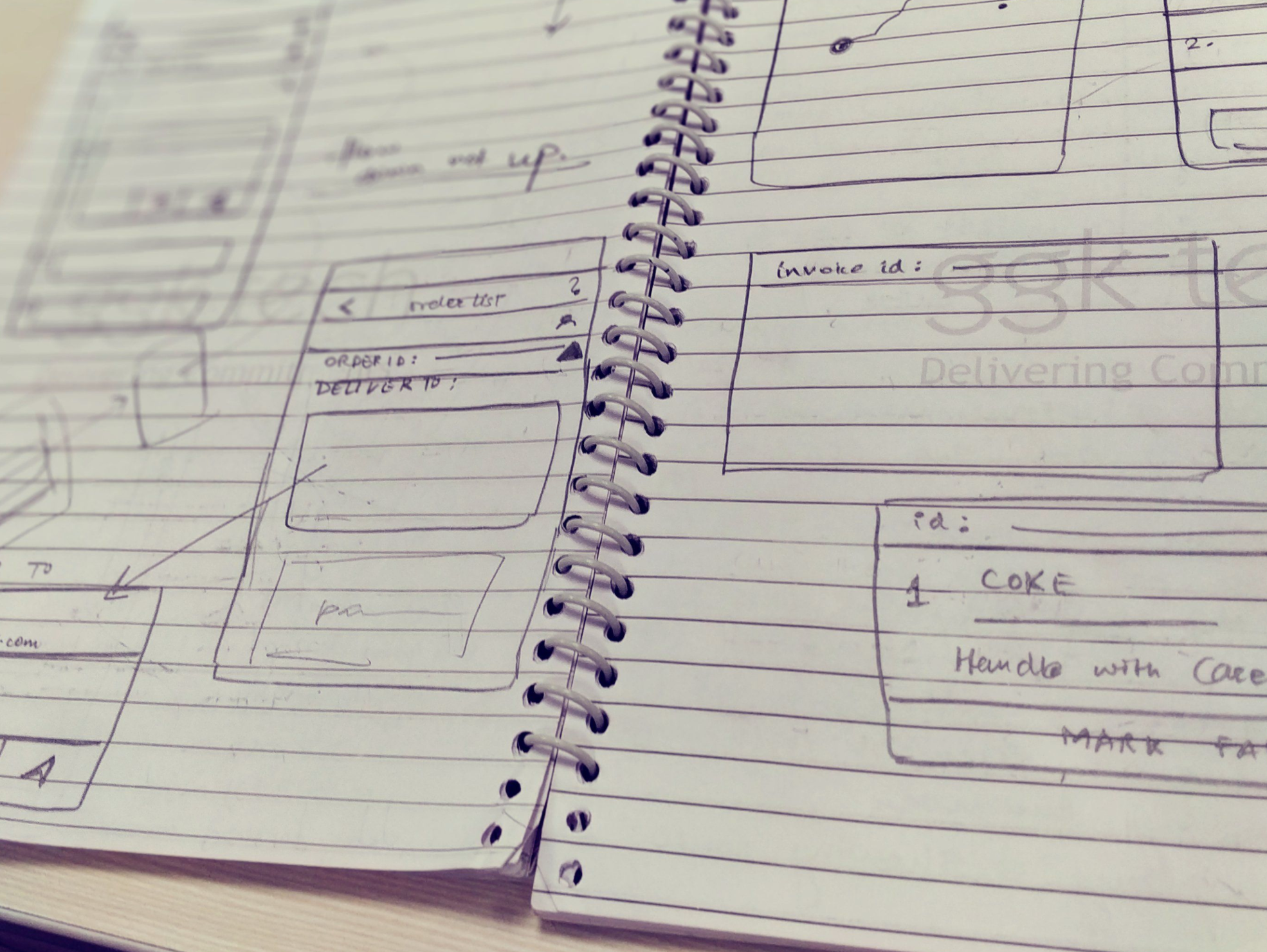
#Sketching and wireframing
Our stories, flows, red routes, business hypothesis solution, and personas are now deployed to give us our first iterations of the iOS app. By now we have a good idea of where to start, the red routes told us what our users are most commonly telling us: We want to operate the app in both online (full functions) and offline mode, we want to see a listing of manifests with manifest ID, packages, orders, time, volume, weight, delivery date, I want to visualize all deliveries within the manifest plotted on a map within the app. By keeping these close to the design at all times, I can focus my UX and build other functions around it.


#Iterations
It was an iterative process, we started with pretty native designs and then gradually moved towards the designs satisfying the acceptance criteria.

#Final Designs
iOS & Android Native App Design
Having concluded our testing and design for the previous stage, it was time to create a more viable design based on many well-thumbed sketches. Although testing will reveal further amends and iterations, we feel happy we’ve ironed out most of the bugs and have something on paper that will spring to life once designed and prototyped. Using the Axure RP, Adobe XD, and trying out the libraries function for the first time, I designed the screen flows and completed the prototype.


#UI Design Guidelines
We used the standard Client’s design guidelines, including all its icons and typography. We improved the visual language on the way, whilst highlighting its key areas based on our red route stories. The UI followed after that using native design elements as well as bespoke details cards which could convey information to the user as well letting him do some basic task. The icon set was designed following Pronto’s brand guidelines and the ones they used in their previous apps.


→ Test
We gave out the prototype for some of the users of this application and later asked them to fill out the SUS documentation which gave us clear results about the success of our designs.
They had allotted on an average $458 per user as training cost of the tool, intuitive UX of the app helped them save that cost. Delivery drivers could easily adapt the app to their process and they didn’t need to undergo training. It saved a lot of money for the company and resources that were supposed to deploy for the training.
Reflecting on the work I’ve done here
Thanking the awesome team that got together to work on this specific project. I learned from each and every one.
I think one of the best things about the learning and creation process is that you come to curate your own. You learn what works, and what doesn’t. You learn how to do things faster, better, and more efficiently. You learn random things along the way while trying to learn about the thing you actually set out to learn.
And the cherry on top of that is that it doesn’t end. The learning process is continuous.
“Invention Over Convention”
And that’s a wrap. Thank you so much for reading! Give it a clap if you liked it.
Personally reach out to me at Sakshammishra.com
